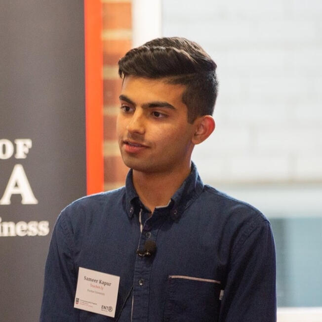
This is the case study for Munch, a web app created for Capital One’s MindSumo restaurant challenge. I worked with Sahil Kapur to create a better restaurant choosing process for users over the course of one week.
Establishing Context
The challenge: We have all been there. Picking a restaurant can sometimes be a daunting task. Even with Yelp, it is never easy. The endless variables, from cuisine, price, and location to rating and hours, can be overwhelming.
We imagined that there were ways to make the process of choosing a restaurant easier and more intuitive. The challenge required us to use Yelp’s Fusion API, plot merchants on a map, and obtain user location via HTML5 Geolocation.
Who am I solving for
Because picking a restaurant is such a broad problem that affects everyone, we decided to narrow the target audience to college aged students within generation z. Being part of the target audience would allow us to have a better understanding of the problem scope and how we could solve it for people our age. Additionally, we knew we would be able to ask our friends for input on the problem and test our final solution on them.
Insights and learning
After discussing the problem with my close friends, I was able to get a better sense of what questions to ask within the scope of choosing a restaurant. I was curious to know the motivations behind using any of the current apps or websites on the market and what users were longing to have. The goal of the survey was to better understand pain points within the scope of restaurant choosing and scout for ideas which would turn into Munch. These questions included:
- How do you choose where to eat everyday? Do you currently use any apps or websites to help you choose restaurants?
- What frustrates you about choosing a restaurant?
- When you go to a new city, how do you choose where to eat?
- If you had a magic wand, what would you add to any of the tools you currently use?
I wanted to keep the survey short at no more than 5 questions to make it easy enough for friends and acquaintances to fill it out. We received ~30 responses to the survey over the course of three days. I mostly reached out to college-aged students from my personal network and so 90% of the responses were from generation z.
Several different themes stood out among all our responses:
- DoorDash, Uber Eats, Google Maps, and Yelp are survey participants favorite tools to help decide where to eat. People use DoorDash and Uber Eats to find restaurants even if they are not ordered delivery from them. The “Fastest near you” category on DoorDash is a starting point for many students to determine quick bites as students are constantly on the go and food is often an afterthought.
- Survey participants wish that DoorDash and Uber Eats had better recommendations based on past orders and the ability to like and dislike restaurants. Survey participants want the platforms they use show them more of what they like and less of what they don’t.
- Most of the survey participants said they enjoy going to trendy spots in cities they visit. I imagine that this is a common trait among all gen z’ers. Survey participants cared about what their friends were eating as well as new food critics on instagram, like Bay Area Foodies. Survey participants complained that
- For new cities, survey participants wanted to try places that were deemed unique to the city. Access to restaurant tips by signature dishes and stories would also be interesting.
Design Audit
It’s always important to explore the current solutions to get a sense of what is in the market. I went through Yelp, DoorDash, Uber Eats and Resy. Researching other platforms in depth gave me a greater understanding in terms of ui/ux for Munch and base to start designing.
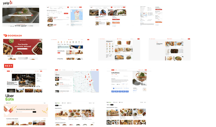
Some of my initial thoughts:
- Yelp is clunky and crowded. Even with their UI facelift which happened earlier this year, there is just too much happening on each page. Yelp starts by asking the type of cuisine desired and then the city preferred. The results page has hundreds of options leading to users scrolling for days.
- DoorDash and Uber Eats seem to mirror each other, with Doordash having a few more features. Both sites are silky smooth, don’t overload the user with information, and focus on getting the user to add items to the cart. Quality, large pictures of food make up most of both sites. I love the curated collections of restaurants and meals on both sites. Very little information on restaurant and all attention is on individual items. Because the focus in on ordering specific dishes, a lot of the information on the restaurants are left out.
- Resy is information heavy and more focused on providing content to users by articles, videos, and collections. Their focus is to get users to make reservations at restaurants which is why slightly different questions are asked on Resy.
Product Opportunity
Over coffee and crepes at Greyhouse, we brainstormed ways to solve several of the issues identified through the survey responses and the design audit.
We decided on three main goals for Munch:
- Curate the top 5 restaurants for users all while asking for the least amount of data possible to provide results quickly. Reduce information overload.
- Let users browse popular collections from influencers and friends across the web.
- Get smarter with every search. Be able to take in data on what users like and dislike and use that information to provide better search results in the future.
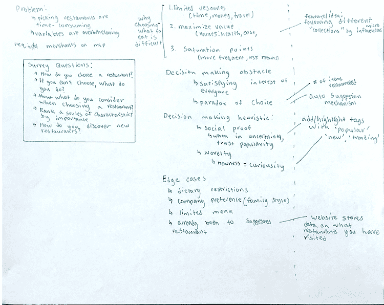
Wireframing + prototyping
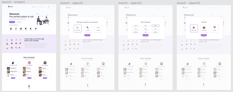
After doing some rough wireframing on paper, we used Figma to design mockups of the MVP for Munch. This was the first time we used Figma for designing, instead of Sketch.

Solution
Munch helps individuals discover places to eat around them. Using just the responses from three questions, Munch curates the top five recommended restaurants. Munch gets smarter every time you use it based on what restaurants you like and dislike. Munch also lets individuals browse trending restaurants and where popular influencers are eating at.
Check out Munch running live: munch.fun
We used Next.js for it’s speed with developing multi-page React applications with speed. The React code uses Hooks for managing lifestyle and state, which eases clarity in writing code. Since Next.js does not support CSS, all styling is done with inline CSS, making some styling blocks long, but keeping all styling attached to their components allows for faster modifications. The application is hosted on Google Cloud.
Outcome + Next Steps
We really enjoyed working on the challenge for Capital One. Within one week, we were able to design a web app from start to finish using the Yelp API to help users discover places to eat.
Given more time, we would love to build out the back end for Munch, source real data for the influencer categories, and polish the MVP some more.
Thanks for reading! Please let us know if you liked reading about Munch and any questions + feedback you may have about what we built :)

That's all, folks!
Heya! this was written by me, Sameer! I love talking about product growth, the latest startups and many other things that won’t fit in this sentence. I try to write about what I've learned or done every once in a while. Follow me on Twitter for more frequent updates.
